
Get the Kindle Book FREE for the next 3 days!!! Until April 26th 2024
On Kindle and in Print CAN https://www.amazon.ca/dp/B0D2DQ2Y3N US https://www.amazon.com/dp/B0D2DQ2Y3N
Embark on your journey to becoming a CSS expert with “Mastering CSS: Coding with Style,” a comprehensive guide filled with over 200 hands-on exercises and mini code projects designed to transform beginners into proficient CSS coders. This book is an invaluable resource for anyone aspiring to master the art of styling websites with CSS—from students and hobbyists to seasoned developers looking to refine their skills.
CSS, or Cascading Style Sheets, is the language responsible for the visual and aural layout of web content. It’s what makes websites look good and feel interactive. In this book, you’ll delve deep into everything CSS has to offer, from the basics of text formatting and layout control to advanced techniques involving animations, Flexbox, Grid systems, and responsive design strategies.
Get the book source code at https://github.com/lsvekis/HTML-CSS-Exercises-Book
Why Choose This Book?
Comprehensive Coverage: “Mastering CSS: Coding with Style” covers every aspect of CSS you need to know. Learn how to manipulate everything from colors and fonts to complex layouts and animations.
Practical Learning Approach: With over 200 exercises and projects, this book offers a practical approach to learning. Each exercise builds on the last, solidifying fundamentals while gradually introducing more complex concepts.
Real-World Application: Every chapter includes mini projects that challenge you to apply what you’ve learned in realistic scenarios, preparing you for professional web development tasks.
Expert Tips and Insights: Gain insights into best practices and professional techniques that can save you time and enhance your code’s performance and maintainability.
Resource-Rich Learning: Alongside the exercises, you’ll find tips on how to further your learning using additional online resources, documentation, and community support.
Whether you are starting from scratch or seeking to deepen your existing skills, “Mastering CSS: Coding with Style” provides the tools and knowledge necessary to become a skilled web designer and developer. This book not only teaches you how to style beautifully but also how to think like a seasoned web developer, ensuring that you are ready to tackle any challenge with confidence and creativity.
Dive into this book and start transforming static HTML into visually stunning and interactive web pages with ease and style!
The core of this book is built around more than 200 exercises and mini code projects, each crafted to tackle specific CSS concepts and techniques. Here are several key benefits of this extensive practice-driven approach:
Incremental Learning: Each exercise builds on the previous one, ensuring you grasp basic concepts before moving on to more complex tasks. This step-by-step progression solidifies your understanding and retention of CSS rules and properties.
Practical Application: By engaging with practical examples and real-world scenarios, you translate abstract concepts into tangible skills. This direct application of knowledge helps solidify learning and demonstrates the real-world utility of CSS.
Problem-Solving Skills: Exercises encourage you to think critically and creatively about how CSS can be used to solve design and layout challenges, enhancing your problem-solving abilities.
Immediate Feedback: Working through these exercises provides instant feedback on your coding, allowing you to learn from mistakes and make corrections in real time. This iterative process is crucial for mastering any programming language.
Diversity of Techniques: The wide range of exercises exposes you to various CSS features, from basic styling to advanced animations and grid layouts. This comprehensive exposure ensures you’re well-prepared to tackle any CSS task in your professional projects.
Introduction Welcome to Web Design!
“Mastering CSS Coding with Style : Over 200 CSS based Exercises with Mini Code Projects”! This book is your step-by-step guide to understanding the basics of HTML and CSS and applying them to create visually appealing and functional websites. Whether you are a beginner eager to dive into the world of web development or a seasoned professional looking to brush up your skills, this book offers practical exercises and insights to enhance your understanding.
HTML (HyperText Markup Language) and CSS (Cascading Style Sheets) are the backbone of web design and development. HTML provides the structure, while CSS adds style to make websites visually engaging and user-friendly. This book will guide you through various exercises, from simple text formatting to complex responsive designs, each designed to build your competence and confidence in using HTML and CSS.
As you progress through the chapters, you will learn to craft websites that are not only functional but also responsive to various devices, enhancing user experience. The exercises will encourage you to apply the concepts in real-world scenarios, ensuring that you not only understand the theories but can also implement them effectively.
Welcome to “Mastering CSS: Coding with Style,” your comprehensive guide to becoming proficient in Cascading Style Sheets (CSS) through a hands-on, exercise-driven approach. This book is designed for anyone who wishes to deepen their understanding of CSS—from beginners just starting out, to more advanced coders looking to refine and expand their skills.
CSS is a powerful language essential for creating visually compelling and technically robust websites. It controls the layout, appearance, and feel of your webpage, making it an indispensable skill for web developers and designers alike.
Benefits of Over 200 Exercises for Coding CSS
The core of this book is built around more than 200 exercises and mini code projects, each crafted to tackle specific CSS concepts and techniques. Here are several key benefits of this extensive practice-driven approach:
- Incremental Learning: Each exercise builds on the previous one, ensuring you grasp basic concepts before moving on to more complex tasks. This step-by-step progression solidifies your understanding and retention of CSS rules and properties.
- Practical Application: By engaging with practical examples and real-world scenarios, you translate abstract concepts into tangible skills. This direct application of knowledge helps solidify learning and demonstrates the real-world utility of CSS.
- Problem-Solving Skills: Exercises encourage you to think critically and creatively about how CSS can be used to solve design and layout challenges, enhancing your problem-solving abilities.
- Immediate Feedback: Working through these exercises provides instant feedback on your coding, allowing you to learn from mistakes and make corrections in real time. This iterative process is crucial for mastering any programming language.
- Diversity of Techniques: The wide range of exercises exposes you to various CSS features, from basic styling to advanced animations and grid layouts. This comprehensive exposure ensures you’re well-prepared to tackle any CSS task in your professional projects.
Mastering CSS with Exercises in Code
Each exercise in this book is designed not only to teach CSS syntax but also to demonstrate best practices and professional tips that will guide you to write clean, efficient, and responsive code. As you progress, you’ll learn to:
- Style text and control fonts for readability and impact.
- Use Flexbox and CSS Grid to create sophisticated layouts that are responsive and mobile-friendly.
- Implement advanced selectors, transitions, and animations to enhance user interaction.
- Manage and maintain large stylesheets effectively with CSS variables and preprocessors.
How to Best Use and Get the Most Out of the Book
To maximize the benefits from “Mastering CSS: Coding with Style,” consider the following tips:
- Practice Regularly: Make a habit of coding daily. Consistency is key when learning to code. Even short daily sessions can be more beneficial than sporadic, lengthy ones.
- Experiment: Don’t be afraid to tweak the exercises. Experimenting with code by changing values and properties can lead to a deeper understanding of how CSS works.
- Use Additional Resources: While this book is comprehensive, pairing it with online resources, documentation, and community forums can enhance your learning experience.
- Project Application: Apply what you learn in mini projects that challenge you to use multiple CSS features together. This integrated approach helps cement your knowledge and build confidence.
- Review Often: Regularly revisit chapters and exercises. Repetition is crucial for long-term retention.
“Mastering CSS: Coding with Style” is more than just a textbook—it’s a workshop designed to take you from CSS novice to proficient coder. Dive in, enjoy the journey, and emerge as a skilled web designer ready to tackle any challenge with style!
Source Code
Get the book source code at https://github.com/lsvekis/HTML-CSS-Exercises-Book
Learn more about Web Design at
Chapter 1: Introduction to CSS Styling
Welcome to the exciting world of CSS (Cascading Style Sheets)! This chapter aims to introduce you to various CSS techniques that can transform the way your web content looks and feels. By mastering CSS, you’ll be able to create visually appealing and responsive web designs that stand out. Let’s embark on this journey by exploring different aspects of CSS styling.
Key Concepts Covered:
- Styling Text with CSS Text styling is fundamental in web design, affecting how users interact with content. CSS provides a wide range of properties for text styling, including color, font size, and text alignment. For example, you can make text blue, enlarge its font to 20 pixels, or center it within its container. These properties enhance readability and visual appeal, making content engaging for users.
- Creating Flexible Layouts with Flexbox Flexbox is a powerful layout model that offers an efficient way to distribute space and align items in a container. By setting a container to display: flex;, you can easily control the layout’s direction, spacing, and alignment. Flexbox is ideal for creating responsive designs that adapt to different screen sizes, making it a staple in modern web development.
- Styling Links with Pseudo-classes Links are interactive elements that guide users through your website. CSS pseudo-classes like :link, :visited, :hover, and :active allow you to style links based on their state, enhancing the user experience. For instance, changing link colors on hover can provide visual feedback, indicating to users that an element is clickable.
- Implementing CSS Grid for Layouts CSS Grid is a powerful tool for creating two-dimensional layouts. It allows you to define columns and rows in your container, placing and aligning items within this grid. This method is particularly useful for complex layouts, offering precise control over item positioning and spacing. With CSS Grid, designing responsive and aesthetically pleasing layouts becomes straightforward.
- Bringing Web Pages to Life with CSS Animations Animations can make your website dynamic and engaging. CSS allows you to animate transitions between styles using keyframes. Whether it’s changing colors, moving elements, or transforming properties, animations can guide users’ attention and enhance interactivity.
- Managing Styles with CSS Variables CSS variables (custom properties) enable you to reuse values throughout your stylesheet, making your code more manageable and maintainable. By defining a variable once, you can easily update multiple styles simultaneously, ensuring consistency and reducing redundancy in your stylesheets.
- Crafting Responsive Designs with Media Queries Responsive design is crucial for ensuring your website looks great on any device. CSS media queries allow you to apply styles based on viewport size, orientation, or other factors. This adaptability is key to providing an optimal viewing experience across various devices, from desktops to smartphones.
- Understanding the CSS Box Model The box model is a fundamental concept in CSS, defining how margin, border, padding, and content interact. Mastery of the box model allows for precise control over element spacing and layout, essential for creating well-structured and visually consistent designs.
- Positioning Elements in CSS Positioning is a critical aspect of CSS, enabling you to control the placement of elements on the page. With properties like position: relative;, absolute;, and fixed;, you can fine-tune element positioning for intricate layout designs and dynamic user interfaces.
- Enhancing Interactivity with CSS Transitions CSS transitions add smooth, gradual changes to property values over time. By defining transitions on elements, you can improve the user experience, making interactions like hovering over a button feel more responsive and natural.
This chapter has introduced you to a variety of CSS styling techniques, each contributing to the creation of engaging, flexible, and visually appealing web designs. As you continue to learn and experiment with CSS, you’ll discover even more ways to enhance your web projects. Happy styling!
Styling Text

Learning Objective:
Understand how to style text using CSS, including font properties, color, and text alignment.
Category:
Basics and Text Styling
Code:
<!DOCTYPE html>

<html>

<head>

 <style>

 .highlighted-text {

 color: blue;

 font-size: 20px;

 text-align: center;

 }

 </style>

</head>

<body>

<h1 class="highlighted-text">Hello, CSS World!</h1>

</body>

</html>
Explanation:
This exercise introduces basic text styling properties in CSS. The .highlighted-text class is defined within the <style> tag in the <head> section of the HTML document. It applies three properties to any HTML element with this class:
- color: blue; changes the text color to blue.
- font-size: 20px; sets the size of the font to 20 pixels.
- text-align: center; aligns the text to the center of its container (in this case, the <body> element).
Layout with Flexbox

Learning Objective:
Learn to use Flexbox for creating flexible and responsive layouts.
Category:
Layouts and Flexbox
Code:
<!DOCTYPE html>

<html>

<head>

 <style>

 .flex-container {

 display: flex;

 justify-content: space-around;

 align-items: center;

 height: 200px;

 background-color: lightgray;

 }

 .flex-item {

 background-color: cornflowerblue;

 padding: 20px;

 margin: 5px;

 }

 </style>

</head>

<body>

<div class="flex-container">

 <div class="flex-item">Flex Item 1</div>

 <div class="flex-item">Flex Item 2</div>

 <div class="flex-item">Flex Item 3</div>

</div>

</body>

</html>
Explanation:
This code demonstrates how to use CSS Flexbox to create a flexible layout. The .flex-container class sets up a flex container by using display: flex;. It also uses justify-content: space-around; to distribute space around the flex items and align-items: center; to align items vertically in the center. The .flex-item class applies styling to each flex item. This exercise teaches the basics of creating responsive layouts with Flexbox.
Styling Links

Learning Objective:
Learn to style links differently based on their state (e.g., hover, visited).
Category:
Pseudo-classes and Links
Code:
<!DOCTYPE html>

<html>

<head>

 <style>

 a:link {

 color: green;

 }

 a:visited {

 color: purple;

 }

 a:hover {

 color: red;

 }

 a:active {

 color: yellow;

 }

 </style>

</head>

<body>

<a href="https://www.example.com">Visit Example.com</a>

</body>

</html>
Explanation:
This exercise focuses on styling links using pseudo-classes. Each pseudo-class targets a different state of the link:
- a:link styles unvisited links.
- a:visited applies styles to links that have been visited by the user.
- a:hover changes the link’s style when the mouse hovers over it.
a:active applies styles when the link is being clicked.
- Learning to style links is essential for improving user experience on websites.
Creating a Simple Grid Layout

Learning Objective:
Understand how to create a simple grid layout using CSS Grid.
Category:
Layouts and CSS Grid
Code:
<!DOCTYPE html>

<html>

<head>

 <style>

 .grid-container {

 display: grid;

 grid-template-columns: auto auto auto;

 gap: 10px;

 background-color: #f2f2f2;

 }

 .grid-item {

 background-color: rgba(255, 99, 71, 0.6);

 padding: 20px;

 text-align: center;

 }

 </style>

</head>

<body>

<div class="grid-container">

 <div class="grid-item">1</div>

 <div class="grid-item">2</div>

 <div class="grid-item">3</div>

</div>

</body>

</html>
CSS Animations
Learning Objective:
Learn to create simple animations using keyframes in CSS.
Category:
Animations
Code:
<!DOCTYPE html>

<html>

<head>

 <style>

 @keyframes example {

 from {background-color: red;}

 to {background-color: yellow;}

 }

 .animated-box {

 width: 100px;

 height: 100px;

 background-color: red;

 animation-name: example;

 animation-duration: 4s;

 }

 </style>

</head>

<body>

<div class="animated-box"></div>

</body>

</html>
Explanation:
This exercise introduces the concept of CSS animations using @keyframes. The animation changes the background color of a box from red to yellow over 4 seconds. The @keyframes rule specifies the animation code, with from and to indicating the start and end states of the animation. The .animated-box class applies this animation with animation-name: example; and sets its duration with animation-duration: 4s;.
CSS Variables

Learning Objective:
Understand how to use CSS variables for more manageable and maintainable style sheets.
Category:
Advanced Styling Techniques
Code:
<!DOCTYPE html>

<html>

<head>

 <style>

 :root {

 --main-bg-color: coral;

 --main-text-color: white;

 }

 body {

 background-color: var(--main-bg-color);

 color: var(--main-text-color);

 }

 </style>

</head>

<body>

<p>Welcome to the world of CSS variables!</p>

</body>

</html>
Explanation:
This exercise demonstrates the use of CSS variables, which allow for easier management of styles that are used in multiple places. Variables are defined in the :root pseudo-class for global scope, making them available throughout the entire document. The variables –main-bg-color and –main-text-color are used to set the background color and text color of the body, respectively. CSS variables enhance the flexibility and reusability of CSS styles.
Responsive Design with Media Queries

Learning Objective:
Learn to create responsive designs that adapt to different screen sizes using media queries.
Category:
Responsive Design
Code:
<!DOCTYPE html>

<html>

<head>

 <style>

 body {

 background-color: lightgreen;

 }

 @media (max-width: 600px) {

 body {

 background-color: lightblue;

 }

 }

 </style>

</head>

<body>

<p>Resize the window to see the background color change.</p>

</body>

</html>
Explanation:
This exercise teaches how to use media queries for responsive design. The @media rule checks the width of the viewport, and if it’s 600px or smaller, it changes the background color of the body from lightgreen to lightblue. This technique is crucial for designing websites that look good on both desktops and mobile devices.
The Box Model

Learning Objective:
Understand the CSS box model, including margin, border, padding, and content areas.
Category:
Box Model
Code:
<!DOCTYPE html>

<html>

<head>

 <style>

 .box {

 background-color: lightcoral;

 width: 100px;

 padding: 20px;

 border: 5px solid black;

 margin: 10px;

 }

 </style>

</head>

<body>

<div class="box">Content</div>

</body>

</html>
Explanation:
The box model is a fundamental concept in CSS, encompassing margin, border, padding, and content. This exercise illustrates how each part of the box model affects the layout of an element. The .box class demonstrates setting a width for the content area, padding around the content, a border outside the padding, and a margin outside the border. Understanding the box model is crucial for controlling spacing and layout in web design.
Positioning Elements
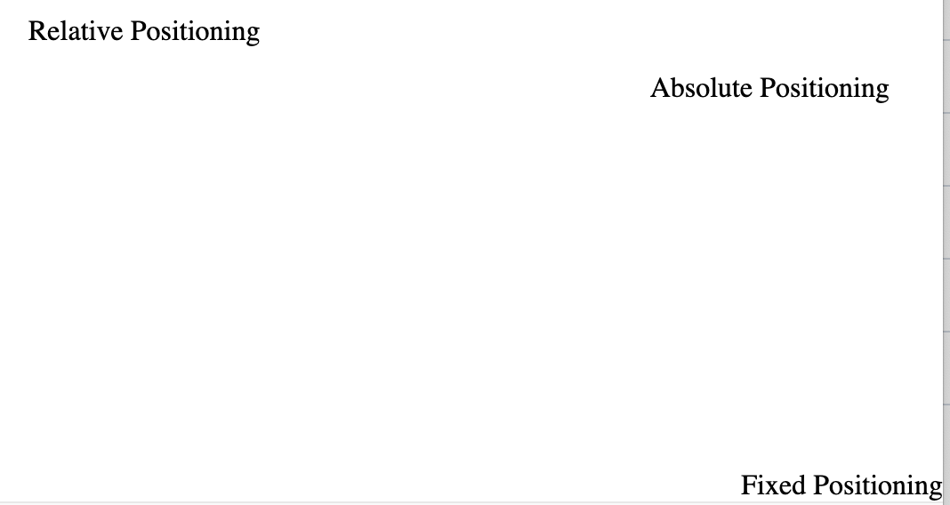
Learning Objective:
Learn to position HTML elements using CSS positioning properties.
Category:
Positioning
Code:
<!DOCTYPE html>

<html>

<head>

 <style>

 .relative {

 position: relative;

 left: 20px;

 top: 10px;

 }

 .absolute {

 position: absolute;

 top: 50px;

 right: 30px;

 }

 .fixed {

 position: fixed;

 bottom: 0;

 right: 0;

 }

 </style>

</head>

<body>

<div class="relative">Relative Positioning</div>

<div class="absolute">Absolute Positioning</div>

<div class="fixed">Fixed Positioning</div>

</body>

</html>
Explanation:
This exercise covers three common CSS positioning schemes: relative, absolute, and fixed.
- Relative positioning moves an element in relation to where it would normally sit in the document flow.
- Absolute positioning places an element exactly where you specify it on the page, based on the nearest positioned ancestor.
Fixed positioning keeps an element fixed on the screen, regardless of scrolling.
- Understanding these positioning techniques is essential for intricate layout designs and dynamic user interfaces.
Using CSS Transitions

Learning Objective:
Learn to add smooth transitions to CSS property changes.
Category:
Transitions and Effects
Code:
<!DOCTYPE html>

<html>

<head>

 <style>

 .transition-box {

 width: 100px;

 height: 100px;

 background-color: tomato;

 transition: width 2s, background-color 2s ease-in-out;

 }

 .transition-box:hover {

 width: 200px;

 background-color: skyblue;

 }

 </style>

</head>

<body>

<div class="transition-box"></div>

</body>

</html>
Explanation:
This exercise teaches the basics of CSS transitions, allowing property changes in CSS to occur smoothly over a specified duration. The .transition-box class applies a transition effect to the width and background-color properties over 2 seconds. The ease-in-out timing function makes the speed of the transition start slow, become faster in the middle, and slow down again at the end. Hovering over the box demonstrates the transition effect, enhancing the user’s visual experience.
Quiz Questions
Question 1: What does the CSS property font-size: 20px; do in the context of the .highlighted-text class?
A) Changes the text color to blue
B) Aligns the text to the center
C) Sets the size of the font to 20 pixels
D) Applies a background color
Correct Answer: C) Sets the size of the font to 20 pixels
Explanation: The font-size property specifies the size of the font. In this case, setting font-size: 20px; within the .highlighted-text class makes the text size 20 pixels, which affects how large the text appears on the screen.
Question 2: What is the purpose of the justify-content: space-around; property in a Flexbox container?
A) To distribute extra space evenly between and around flex items
B) To align flex items at the center of the container
C) To set the background color of the container
D) To create a wrapping effect for items
Correct Answer: A) To distribute extra space evenly between and around flex items
Explanation: The justify-content: space-around; property is used in a Flexbox container to distribute the available space around the flex items evenly. This means there will be space before the first item, between each item, and after the last item, ensuring an evenly spaced layout.
Question 3: Which pseudo-class is used to change the style of a link when the mouse hovers over it?
A) :link
B) :visited
C) :hover
D) :active
Correct Answer: C) :hover
Explanation: The :hover pseudo-class is used to define a special state of an element when the mouse hovers over it. In the context of styling links, :hover changes the appearance of the link to indicate that it is currently under the cursor, enhancing user interaction.
Question 4: In CSS Grid, what does grid-template-columns: auto auto auto; do?
A) Creates a grid with three columns of equal width
B) Sets the grid row size automatically
C) Distributes space equally between grid items
D) Defines three columns with automatic width based on content
Correct Answer: D) Defines three columns with automatic width based on content
Explanation: The grid-template-columns: auto auto auto; property in CSS Grid defines the number and size of columns in a grid layout. Here, it specifies three columns, each with a width that automatically adjusts based on the content’s size.
Question 5: What is the role of @keyframes in CSS animations?
A) To specify the animation duration
B) To define the colors used in the animation
C) To create a transition effect between two states
D) To define the sequence of styles that the animation will go through
Correct Answer: D) To define the sequence of styles that the animation will go through
Explanation: The @keyframes rule in CSS animations is used to define the sequence of styles that an element will go through during the animation. By specifying styles at various points from the start (from) to the end (to) of the animation, developers can control the visual transitions and transformations that occur.