Web Page Examples CSS HTML

To create a CSS grid for four child divs that are arranged in a two-by-two grid within a parent element, you can use the following code:
HTML:
<div class=”grid-container”>
<div class=”grid-item”>Div 1</div>
<div class=”grid-item”>Div 2</div>
<div class=”grid-item”>Div 3</div>
<div class=”grid-item”>Div 4</div>
</div>
CSS:
.grid-container {
display: grid;
grid-template-columns: repeat(2, 1fr);
grid-template-rows: repeat(2, 1fr);
gap: 10px;
}
.grid-item {
background-color: #f1f1f1;
padding: 20px;
text-align: center;
}
In this code, we first create a parent element with the class grid-container. We set its display property to grid, which makes it a grid container. We then set the grid-template-columns property to repeat(2, 1fr) and grid-template-rows to repeat(2, 1fr), which creates a grid with two rows and two columns. Finally, we set the gap property to 10px to create a gap between the grid items.
We then create the four child divs with the class grid-item, which we want to arrange in the grid. We set their background color to #f1f1f1 and add some padding to create some space between the content and the edges of the div. Finally, we center the text within the div using the text-align property.
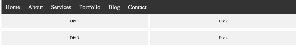
With Responsive Navigation menu

Regular page over 600px wide
<!DOCTYPE html>
<html>
<head>
<title>Nav Menu</title>
<style>
.navbar {
background-color: #333;
overflow: hidden;
}
.navbar a {
color: #f2f2f2;
text-decoration: none;
font-size: 1.5em;
padding: 14px 16px;
float: left;
display: block;
text-align: center;
}
.navbar a:hover {
background-color: #ddd;
color: black;
}
.navbar .icon {
display: none;
}
@media screen and (max-width: 600px) {
.navbar a:not(:first-child) {
display: none;
}
.navbar .icon {
display: block;
float: right;
}
.navbar.responsive {
position: relative;
}
.navbar.responsive .icon {
position: absolute;
right: 0;
top: 0;
}
.navbar.responsive a {
float: none;
display: block;
text-align: left;
}
}
.grid-container {
display: grid;
grid-template-columns: repeat(2, 1fr);
grid-template-rows: repeat(2, 1fr);
gap: 10px;
}
.grid-item {
background-color: #f1f1f1;
padding: 20px;
text-align: center;
}
</style>
</head>
<body>
<nav class=”navbar”>
<a href=”#” class=”icon”>☰</a>
<a href=”#”>Home</a>
<a href=”#”>About</a>
<a href=”#”>Services</a>
<a href=”#”>Portfolio</a>
<a href=”#”>Blog</a>
<a href=”#”>Contact</a>
</nav>
<div class=”grid-container”>
<div class=”grid-item”>Div 1</div>
<div class=”grid-item”>Div 2</div>
<div class=”grid-item”>Div 3</div>
<div class=”grid-item”>Div 4</div>
</div>
<script>
document.querySelector(‘.icon’).onclick = function () {
const ele = document.querySelector(‘.navbar’);
if (ele.className === ‘navbar’) {
ele.className += ‘ responsive’;
}
}
</script>
</body>
</html>