
Explore modern web development through practical HTML and CSS examples, interactive experimentation, responsive design, creative projects, and AI-assisted learning.
Stop Memorizing HTML and CSS. Start Creating Websites.
Every website begins with an idea.
A personal portfolio, an online store, an educational platform, an interactive dashboard, or a business website all share two fundamental technologies: HTML and CSS.
HTML provides the structure and meaning.
CSS controls the visual presentation, layout, and responsive behavior.
Together, they allow you to transform ideas into digital experiences that people can interact with across different devices.
However, learning web development shouldn’t simply involve memorizing HTML elements and CSS properties. It should involve experimenting, exploring design possibilities, solving layout problems, and building meaningful projects.
That’s why I’ve created the HTML & CSS Discovery Academy, a free educational resource focused on developing practical web development skills.
Explore the Academy:
https://discoveryvip.com/html-css-discovery-academy
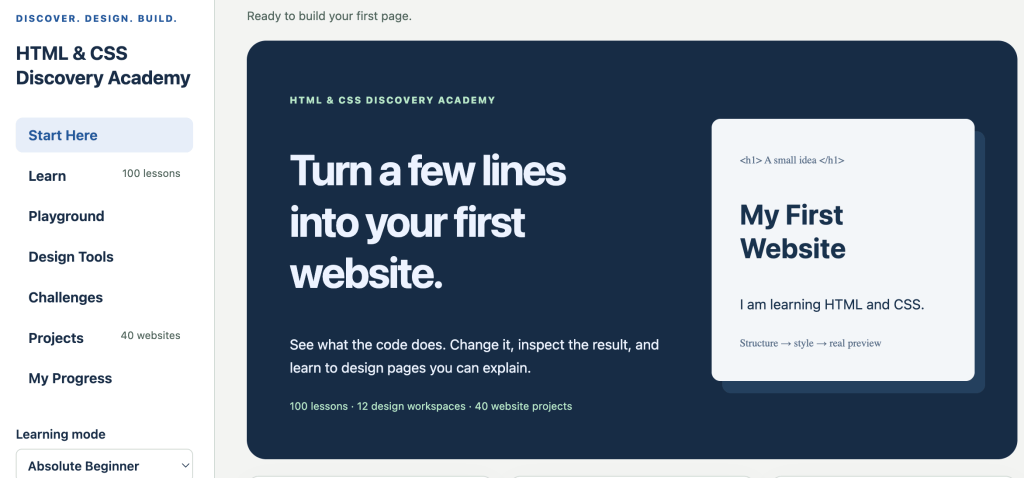
In this article, we’ll explore modern HTML and CSS techniques, practical examples, responsive layouts, accessibility, reusable design systems, AI-assisted development, and complete website projects.
Whether you’re building your first website or improving your frontend development skills, there’s always something new to discover.
1. Understanding How Websites Work
Before building a website, it’s helpful to understand the responsibilities of the three primary frontend technologies.
| Technology | Responsibility |
|---|---|
| HTML | Structure, content, and meaning |
| CSS | Presentation, layout, and visual design |
| JavaScript | Interactivity, behavior, and application logic |
Think of a website as a house.
HTML provides the foundation, walls, rooms, and doors.
CSS determines the colors, decorations, furniture arrangements, and visual appearance.
JavaScript adds functionality, such as opening doors automatically, controlling lighting, and responding to interactions.
While JavaScript introduces powerful capabilities, HTML and CSS alone can create sophisticated, responsive, accessible websites.
Your First HTML and CSS Experiment
Create a file named index.html and add the following code:
<!DOCTYPE html>
<html lang="en">
<head>
  <meta charset="UTF-8">
  <meta name="viewport"
        content="width=device-width, initial-scale=1">

  <title>My First Website</title>

  <style>
    body {
      font-family: system-ui, sans-serif;
      background: #f1f5f9;
      color: #1e293b;
      padding: 40px;
    }

    h1 {
      color: #2563eb;
    }

    p {
      font-size: 18px;
      line-height: 1.6;
    }
  </style>
</head>

<body>
  <h1>Welcome to My Website</h1>

  <p>
    I'm discovering how HTML and CSS
    work together to create websites.
  </p>
</body>
</html>
Open the file in your browser.
Now experiment with the background color, heading size, font family, and spacing.
Observe how each CSS property changes the presentation without modifying the underlying HTML content.
You’ve already started exploring one of the most important principles of frontend development: separating structure from presentation.
2. Semantic HTML: Build Websites with Meaning
HTML is more than a collection of visual elements.
Semantic HTML describes the meaning and purpose of content.
Consider this example:
<div class="header">My Website</div>
<div class="navigation">Navigation</div>
<div class="content">Main Content</div>
<div class="footer">Copyright</div>
Although this structure can be styled, the elements themselves provide little information about their purpose.
A more meaningful approach uses semantic HTML.
<header>
  <h1>My Website</h1>
</header>

<nav aria-label="Main navigation">
  <a href="#home">Home</a>
  <a href="#about">About</a>
  <a href="#contact">Contact</a>
</nav>

<main>
  <section id="home">
    <h2>Welcome</h2>
    <p>Discover modern web development.</p>
  </section>

  <section id="about">
    <h2>About</h2>
    <p>Learn through practical projects.</p>
  </section>

  <section id="contact">
    <h2>Contact</h2>
    <p>Get in touch to learn more.</p>
  </section>
</main>

<footer>
  <p>Copyright 2026</p>
</footer>
Semantic elements give browsers, assistive technologies, and developers additional information about the page.
Essential Semantic HTML Elements
| Element | Purpose |
|---|---|
| header | Introductory content |
| nav | Navigation links |
| main | Primary page content |
| section | Thematically related content |
| article | Independent, self-contained content |
| aside | Supplementary information |
| footer | Footer information |
| figure | Self-contained media or illustrations |
| figcaption | Description of a figure |
| time | Machine-readable date or time |
| address | Contact information |
Semantic HTML contributes to accessibility, maintainability, and content organization. It can also help search engines interpret page structure.
Discovery Challenge
Take an existing website and examine its HTML using your browser’s developer tools.
Identify its header, navigation, main content, sections, and footer.
Could the structure be improved using more meaningful elements?
3. CSS Selectors: Discover How Styling Works
CSS selectors determine which HTML elements receive particular styles.
Understanding selectors allows you to design reusable and maintainable stylesheets.
Element Selectors
p {
  color: #475569;
  line-height: 1.7;
}
This targets every paragraph.
Class Selectors
.highlight {
  background: #fef3c7;
  padding: 16px;
}
Apply the class to an HTML element:
<p class="highlight">
  This is an important learning tip.
</p>
ID Selectors
#main-title {
  font-size: 42px;
}
An ID should be unique within the document.
Descendant Selectors
.card p {
  color: #64748b;
}
This targets paragraphs inside elements with the card class.
Attribute Selectors
input[type="email"] {
  border: 2px solid #2563eb;
}
Pseudo-classes
button:hover {
  background: #1d4ed8;
}

button:focus-visible {
  outline: 3px solid #f59e0b;
  outline-offset: 4px;
}
Pseudo-classes allow styles to respond to interaction states and document conditions.
Experiment with Selectors
<div class="card featured">
  <h2>JavaScript Fundamentals</h2>
  <p>Learn programming through discovery.</p>
</div>

<div class="card">
  <h2>CSS Fundamentals</h2>
  <p>Explore modern web design.</p>
</div>
.card {
padding: 24px;
border: 1px solid #cbd5e1;
border-radius: 12px;
}
.card.featured {
border-color: #2563eb;
background: #eff6ff;
}
.card h2 {
margin-top: 0;
}Notice how common styles are reused while individual cards can receive additional visual characteristics.
This is the foundation of component-based styling.
4. Understand the CSS Cascade and Specificity
One of the most common questions beginners encounter is:
Why isn’t my CSS working?
Sometimes multiple CSS rules target the same element.
<p class="message" id="welcome">
  Welcome to the Discovery Academy!
</p>
p {
color: blue;
}
.message {
color: green;
}
#welcome {
color: purple;
}Which color will appear?
Under ordinary author styles without additional cascade factors, the text will be purple because the ID selector has greater specificity.
A Simplified Specificity Guide
| Selector | Specificity |
|---|---|
Universal selector * | 0-0-0 |
Element selector p | 0-0-1 |
Class selector .message | 0-1-0 |
Attribute selector [type] | 0-1-0 |
ID selector #welcome | 1-0-0 |
The complete CSS cascade also considers origins, importance, cascade layers, and source order.
Best Practices
- Prefer reusable class selectors.
- Avoid unnecessarily complex selectors.
- Organize related styles together.
- Use consistent naming conventions.
- Avoid relying on
!importantto solve ordinary styling problems. - Inspect conflicting rules using developer tools.
Understanding the cascade makes CSS significantly easier to debug and maintain.
5. The CSS Box Model: Understand Space and Layout
Every HTML element generates one or more layout boxes.
Understanding the box model helps explain how elements occupy space on a page.
The standard box model includes four areas:
- Content: text, images, and other content.
- Padding: space between content and border.
- Border: the boundary surrounding the padding.
- Margin: space outside the border.
Explore the Box Model
.box {
  width: 300px;
  padding: 20px;
  border: 5px solid #2563eb;
  margin: 15px;
}
With the default content-box sizing:
Content width:     300px
Horizontal padding: 40px
Horizontal borders: 10px

Total border-box width: 350px
The horizontal margins add another 30 pixels to its nominal outer width.
This behavior can make layouts unexpectedly wider than intended.
Use Border-Box Sizing
*,
*::before,
*::after {
  box-sizing: border-box;
}
Now the specified width includes padding and borders.
.box {
  width: 300px;
  padding: 20px;
  border: 5px solid #2563eb;
}
The total border-box width remains 300 pixels.
This approach simplifies many modern layout calculations.
Discovery Challenge
Create three boxes with different padding, margins, and borders.
Inspect them using your browser’s developer tools.
Compare the results when switching between content-box and border-box.
6. CSS Flexbox: Create Flexible One-Dimensional Layouts
Flexbox is one of the most useful CSS layout systems.
It makes it easier to arrange elements horizontally or vertically, align content, distribute space, and build flexible interfaces.
Create a Flexible Card Layout
<div class="container">
  <div class="card">HTML</div>
  <div class="card">CSS</div>
  <div class="card">JavaScript</div>
</div>
.container {
display: flex;
flex-wrap: wrap;
gap: 20px;
}
.card {
flex: 1 1 200px;
background: #dbeafe;
padding: 30px;
border-radius: 12px;
}Each card has a flexible starting size of 200 pixels and can grow or shrink according to available space.
When the container becomes narrower, cards can wrap onto additional rows.
Essential Flexbox Properties
| Property | Purpose |
|---|---|
| display: flex | Create a flex container |
| flex-direction | Set the main axis |
| justify-content | Distribute items along the main axis |
| align-items | Align items along the cross axis |
| flex-wrap | Allow items to wrap |
| gap | Add spacing between items |
| flex-grow | Determine how items grow |
| flex-shrink | Determine how items shrink |
| flex-basis | Define an initial item size |
| align-self | Override individual item alignment |
Build a Navigation Bar
<header class="navbar">
  <a class="brand" href="#home">
    Discovery Academy
  </a>

  <nav aria-label="Main navigation">
    <a href="#home">Home</a>
    <a href="#learn">Learn</a>
    <a href="#projects">Projects</a>
  </nav>
</header>
.navbar {
display: flex;
justify-content: space-between;
align-items: center;
flex-wrap: wrap;
gap: 20px;
padding: 20px;
background: #172033;
}
.navbar a {
color: white;
text-decoration: none;
}
.navbar nav {
display: flex;
flex-wrap: wrap;
gap: 24px;
}
.brand {
font-size: 22px;
font-weight: 700;
}Flexbox makes this layout flexible without relying on fixed positioning or complicated calculations.
Discovery Challenge
Experiment with:
justify-content: centerjustify-content: space-aroundalign-items: flex-startflex-direction: column
Observe how changing the main axis affects alignment.
7. CSS Grid: Design Powerful Two-Dimensional Layouts
While Flexbox primarily organizes content along one dimension, CSS Grid allows developers to control rows and columns together.
Grid is particularly useful for dashboards, galleries, page layouts, and product collections.
Create a Responsive Grid
<div class="grid">
  <article>HTML Essentials</article>
  <article>CSS Selectors</article>
  <article>Flexbox Layouts</article>
  <article>CSS Grid</article>
  <article>Responsive Design</article>
  <article>Web Accessibility</article>
</div>
.grid {
display: grid;
grid-template-columns:
repeat(auto-fit, minmax(min(100%, 240px), 1fr));
gap: 20px;
}
.grid article {
padding: 30px;
background: #f1f5f9;
border: 1px solid #e2e8f0;
border-radius: 14px;
}This layout automatically adapts to the available container width.
Understanding the Grid Expression
repeat(auto-fit, minmax(min(100%, 240px), 1fr))repeat()creates a repeating column pattern.auto-fitfits as many tracks as the available space allows.minmax()defines minimum and maximum track sizes.min(100%, 240px)helps prevent overflow in narrow containers.1frdistributes remaining available space.
Build a Dashboard Layout
.dashboard {
  display: grid;
  grid-template-columns: 240px minmax(0, 1fr);

  grid-template-areas:
    "header header"
    "sidebar main"
    "footer footer";

  gap: 20px;
}

.header {
  grid-area: header;
}

.sidebar {
  grid-area: sidebar;
}

.main {
  grid-area: main;
}

.footer {
  grid-area: footer;
}
Add a mobile layout:
@media (max-width: 700px) {
  .dashboard {
    grid-template-columns: 1fr;

    grid-template-areas:
      "header"
      "sidebar"
      "main"
      "footer";
  }
}
Grid template areas make larger page layouts easier to visualize and maintain.
Flexbox or Grid?
| Use case | Recommended starting point |
|---|---|
| Navigation bar | Flexbox |
| Button group | Flexbox |
| Vertical alignment | Flexbox |
| Product gallery | Grid |
| Dashboard structure | Grid |
| Complex page layout | Grid |
| Content inside a card | Flexbox |
| Responsive card collection | Grid |
Many modern websites use both layout systems together.
8. Responsive Web Design: Build for Every Screen
A website should work across mobile phones, tablets, laptops, and desktop displays.
Responsive web design adapts content and layouts to the available space rather than creating separate websites for every device.
Start with Fluid Containers
.container {
  width: min(100% - 32px, 1200px);
  margin-inline: auto;
}
The container maintains comfortable spacing on small screens and a maximum width on larger displays.
Make Images Responsive
img {
  max-width: 100%;
  height: auto;
  display: block;
}
Use Mobile-First Media Queries
.layout {
  display: grid;
  grid-template-columns: 1fr;
  gap: 20px;
}

@media (min-width: 768px) {
  .layout {
    grid-template-columns: 1fr 1fr;
  }
}

@media (min-width: 1200px) {
  .layout {
    grid-template-columns: repeat(3, 1fr);
  }
}
Begin with the simplest layout and progressively enhance it for larger screens.
Fluid Typography with Clamp
Modern CSS allows typography to adapt smoothly.
h1 {
  font-size: clamp(2rem, 5vw + 0.5rem, 4rem);
}
This establishes a minimum size, a responsive preferred size, and a maximum size.
Unlike relying exclusively on viewport units, combining relative font units and viewport units provides more flexible behavior.
Container Queries
Media queries respond to viewport conditions.
Container queries allow components to respond to their containing elements.
.course-wrapper {
  container-type: inline-size;
}

.course-card {
  display: grid;
  gap: 16px;
}

@container (min-width: 500px) {
  .course-card {
    grid-template-columns: 160px 1fr;
    align-items: center;
  }
}
This is useful when the same component appears in different parts of a website.
A course card might appear inside a narrow sidebar or across a wide content area.
The component can adapt independently of the overall screen size.
Responsive Design Challenge
Build a three-column card layout.
Test it at viewport widths of:
- 320 pixels
- 375 pixels
- 768 pixels
- 1024 pixels
- 1440 pixels
Look for clipped content, horizontal scrolling, difficult navigation, and uncomfortable text sizes.
Responsive design is not simply about changing the number of columns. It’s about maintaining a usable experience.
9. Create a Reusable CSS Design System
One of the biggest improvements you can make to your development workflow is creating reusable design rules.
A design system establishes consistent colors, typography, spacing, borders, buttons, and interface components.
Define CSS Custom Properties
:root {
  --color-primary: #2563eb;
  --color-primary-dark: #1d4ed8;
  --color-accent: #f59e0b;

  --color-background: #f8fafc;
  --color-surface: #ffffff;
  --color-text: #1e293b;
  --color-muted: #475569;

  --space-sm: 8px;
  --space-md: 16px;
  --space-lg: 24px;
  --space-xl: 40px;

  --radius-sm: 6px;
  --radius-md: 12px;
  --radius-lg: 20px;

  --shadow-sm:
    0 4px 16px rgb(15 23 42 / 0.08);

  --font-family: system-ui, sans-serif;
}
Use these properties throughout your stylesheet.
body {
  font-family: var(--font-family);
  color: var(--color-text);
  background: var(--color-background);
}

.card {
  padding: var(--space-lg);
  background: var(--color-surface);
  border-radius: var(--radius-md);
  box-shadow: var(--shadow-sm);
}

.button {
  display: inline-block;
  padding: var(--space-md) var(--space-lg);
  background: var(--color-primary);
  color: white;
  border-radius: var(--radius-sm);
  text-decoration: none;
}

.button:hover {
  background: var(--color-primary-dark);
}
Now imagine updating the primary color across an entire website.
Instead of modifying dozens of individual CSS rules, change one custom property.
Benefits of Design Systems
- Consistent visual identity
- Faster development
- Reusable components
- Easier maintenance
- More predictable layouts
- Simpler theme customization
This approach becomes increasingly valuable as websites grow.
10. Create Dark Mode with Modern CSS
CSS custom properties make it possible to create alternative color themes.
:root {
  color-scheme: light dark;

  --background: #ffffff;
  --surface: #f1f5f9;
  --text: #172033;
  --border: #cbd5e1;
}

@media (prefers-color-scheme: dark) {
  :root {
    --background: #0f172a;
    --surface: #1e293b;
    --text: #f8fafc;
    --border: #475569;
  }
}

body {
  background: var(--background);
  color: var(--text);
}

.card {
  background: var(--surface);
  border: 1px solid var(--border);
}
The website automatically responds to the user’s preferred operating system or browser color scheme.
No JavaScript is required.
Discovery Challenge
Create three alternative themes:
- Professional blue
- Warm orange and cream
- Dark charcoal and emerald
Keep the HTML unchanged and modify only the design tokens.
This demonstrates how separating content from presentation makes websites flexible and reusable.
11. CSS Transitions and Animations: Add Meaningful Motion
CSS can create engaging visual effects without requiring JavaScript.
However, animation should support usability rather than distract from content.
Create an Interactive Card
.card {
  border-radius: 16px;
  padding: 24px;
  background: white;

  transition:
    transform 200ms ease,
    box-shadow 200ms ease;
}

.card:hover,
.card:focus-within {
  transform: translateY(-5px);
  box-shadow: 0 12px 28px rgb(0 0 0 / 0.12);
}
The transition creates a smooth visual response when the card is hovered over or contains a focused interactive element.
Create a Loading Indicator
<div class="spinner" aria-hidden="true"></div>

<p role="status">Loading content...</p>
.spinner {
width: 40px;
height: 40px;
border: 4px solid #cbd5e1;
border-top-color: #2563eb;
border-radius: 50%;
animation: spin 1s linear infinite;
}
@keyframes spin {
to {
transform: rotate(360deg);
}
}Respect Reduced Motion Preferences
@media (prefers-reduced-motion: reduce) {
  .spinner {
    animation: none;
  }

  .card {
    transition: none;
  }

  .card:hover,
  .card:focus-within {
    transform: none;
  }
}
Users should be able to access the same content without unnecessary movement.
Practical Animation Ideas
- Button interaction feedback
- Card transitions
- Navigation indicators
- Loading states
- Progress indicators
- Expandable interface elements
- Subtle content entrance effects
Effective animation communicates something useful.
12. HTML Forms: Build Accessible User Interfaces
Forms allow websites to collect information from users.
They are fundamental to registration pages, search tools, contact forms, educational quizzes, and web applications.
Create a Contact Form
<form action="/contact" method="post">

  <div class="field">
    <label for="name">Your name</label>

    <input
      id="name"
      name="name"
      autocomplete="name"
      required
    >
  </div>

  <div class="field">
    <label for="email">Email address</label>

    <input
      id="email"
      name="email"
      type="email"
      autocomplete="email"
      required
    >
  </div>

  <div class="field">
    <label for="message">Message</label>

    <textarea
      id="message"
      name="message"
      rows="5"
      maxlength="1000"
      required
    ></textarea>
  </div>

  <button type="submit">
    Send Message
  </button>

</form>
Style the Form
form {
  max-width: 600px;
  margin-inline: auto;
}

.field {
  display: grid;
  gap: 8px;
  margin-bottom: 20px;
}

label {
  font-weight: 600;
}

input,
textarea {
  width: 100%;
  padding: 14px;
  font: inherit;
  border: 1px solid #94a3b8;
  border-radius: 8px;
}

input:focus,
textarea:focus {
  outline: 3px solid #93c5fd;
  outline-offset: 2px;
}

button {
  padding: 14px 24px;
  border: 0;
  border-radius: 8px;
  background: #2563eb;
  color: white;
  font: inherit;
  cursor: pointer;
}

button:hover {
  background: #1d4ed8;
}
HTML provides built-in browser validation through attributes such as:
| Attribute | Purpose |
|---|---|
| required | Require a value |
| type=”email” | Check email format |
| minlength | Establish minimum text length |
| maxlength | Limit text length |
| min | Establish a minimum numeric value |
| max | Establish a maximum numeric value |
| pattern | Check a specified pattern |
| autocomplete | Support appropriate autofill |
This example demonstrates the frontend form. A functioning submission requires a server-side endpoint at /contact, including appropriate validation and security.
Browser validation alone is not sufficient for protecting backend systems.
13. Web Accessibility: Design Websites for Everyone
A visually attractive website isn’t necessarily a usable website.
Accessible web design ensures that more people can navigate, understand, and interact with digital content.
Accessibility should be incorporated throughout development.
Use Meaningful Alternative Text
<img
  src="sales-chart.png"
  alt="Monthly sales increased from January to June"
>
Decorative images generally use empty alternative text:
<img src="decorative-wave.svg" alt="">Complex charts should also provide access to the underlying information or a more detailed explanation when appropriate.
Maintain Visible Keyboard Focus
:focus-visible {
  outline: 3px solid #2563eb;
  outline-offset: 4px;
}
Use Real Interactive Elements
Instead of creating a clickable div:
<div class="button">Submit</div>Use a native button:
<button type="submit">Submit</button>Native elements provide important browser behavior and accessibility semantics.
Add a Skip Navigation Link
<a class="skip-link" href="#main-content">
  Skip to main content
</a>

<main id="main-content" tabindex="-1">
  <h1>Welcome to the Academy</h1>
</main>
.skip-link {
position: absolute;
left: 16px;
top: 16px;
padding: 12px;
background: #172033;
color: white;
transform: translateY(-200%);
}
.skip-link:focus {
transform: translateY(0);
z-index: 1000;
}Accessibility Checklist
- Use semantic HTML.
- Provide descriptive page titles.
- Organize content with meaningful headings.
- Label form controls.
- Provide appropriate image alternatives.
- Ensure adequate color contrast.
- Support keyboard navigation.
- Maintain visible focus indicators.
- Avoid communicating information through color alone.
- Respect reduced motion preferences.
- Test content at different zoom levels.
Accessibility isn’t an optional enhancement. It’s part of building professional websites.
14. Build a Complete Project: Responsive Learning Dashboard
Let’s combine the concepts we’ve explored into a complete website.
This project creates a responsive educational dashboard featuring:
- Semantic HTML
- Responsive navigation
- A modern hero section
- Flexible statistics
- Responsive course cards
- Progress indicators
- Reusable design tokens
- CSS Grid and Flexbox
- Automatic dark mode
- Accessible interactive elements
No JavaScript, frameworks, or external libraries are required.
Complete Source Code
Create a file named index.html.
<!DOCTYPE html>
<html lang="en">
<head>
<meta charset="UTF-8">
<meta
name="viewport"
content="width=device-width, initial-scale=1"
>
<meta
name="description"
content="Explore HTML and CSS through practical learning."
>
<title>Discovery Learning Dashboard</title>
<style>
*,
*::before,
*::after {
box-sizing: border-box;
}
:root {
color-scheme: light dark;
--background: #f5f5f0;
--surface: #ffffff;
--text: #1c2723;
--muted: #52615b;
--border: #dce4df;
--primary: #12664f;
--primary-dark: #0c4b3a;
--accent: #f5b942;
--hero-text: #ffffff;
--radius: 20px;
--shadow:
0 8px 28px rgb(0 0 0 / 0.06);
}
@media (prefers-color-scheme: dark) {
:root {
--background: #111c19;
--surface: #20302a;
--text: #f0fdf4;
--muted: #c0d0c6;
--border: #40554c;
--primary: #176b54;
--primary-dark: #104b3c;
--shadow: none;
}
}
html {
scroll-behavior: smooth;
}
body {
margin: 0;
font-family: system-ui, sans-serif;
background: var(--background);
color: var(--text);
line-height: 1.6;
}
a {
color: inherit;
}
:focus-visible {
outline: 3px solid var(--accent);
outline-offset: 4px;
}
.container {
width: min(100% - 32px, 1200px);
margin-inline: auto;
}
.site-header {
background: var(--surface);
border-bottom: 1px solid var(--border);
}
.navbar {
display: flex;
align-items: center;
justify-content: space-between;
flex-wrap: wrap;
gap: 20px;
padding-block: 18px;
}
.brand {
font-size: 1.3rem;
font-weight: 800;
text-decoration: none;
}
nav {
display: flex;
flex-wrap: wrap;
gap: 24px;
}
nav a {
color: var(--muted);
text-decoration: none;
font-weight: 600;
}
nav a:hover {
text-decoration: underline;
}
.hero {
margin-block: 32px;
padding: clamp(24px, 6vw, 64px);
border-radius: var(--radius);
background: linear-gradient(
135deg,
var(--primary-dark),
var(--primary)
);
color: var(--hero-text);
}
.eyebrow {
color: var(--accent);
text-transform: uppercase;
letter-spacing: 2px;
font-size: 0.8rem;
font-weight: 800;
}
h1 {
font-size: clamp(2rem, 4vw + 1rem, 4rem);
line-height: 1.1;
margin-block: 16px;
max-width: 750px;
}
.hero p {
max-width: 600px;
}
.button {
display: inline-block;
padding: 14px 22px;
margin-top: 12px;
background: var(--accent);
color: #17251f;
border-radius: 10px;
text-decoration: none;
font-weight: 700;
}
.button:hover {
background: #ffd477;
}
.stats,
.course-grid {
display: grid;
grid-template-columns:
repeat(
auto-fit,
minmax(min(100%, 230px), 1fr)
);
gap: 20px;
}
.stat,
.course {
background: var(--surface);
border: 1px solid var(--border);
border-radius: var(--radius);
padding: 24px;
box-shadow: var(--shadow);
}
.stat strong {
display: block;
font-size: 2.2rem;
line-height: 1.2;
}
.stat span {
color: var(--muted);
}
section {
margin-block: 40px;
}
h2 {
font-size: 1.8rem;
margin-bottom: 8px;
}
.section-description {
color: var(--muted);
margin-bottom: 24px;
}
.course {
display: flex;
flex-direction: column;
transition:
transform 200ms ease,
box-shadow 200ms ease;
}
.course:hover,
.course:focus-within {
transform: translateY(-4px);
}
.course-icon {
width: 54px;
height: 54px;
display: grid;
place-items: center;
border-radius: 14px;
background: #d1fae5;
color: #065f46;
font-size: 1.4rem;
font-weight: 800;
}
.course h3 {
margin-bottom: 4px;
font-size: 1.3rem;
}
.course p {
color: var(--muted);
}
.course-progress {
margin-top: auto;
}
progress {
width: 100%;
height: 14px;
accent-color: #16865e;
}
.resource-link {
display: inline-block;
margin-top: 16px;
font-weight: 700;
text-underline-offset: 4px;
}
.site-footer {
margin-top: 56px;
padding-block: 28px;
border-top: 1px solid var(--border);
color: var(--muted);
}
@media (max-width: 600px) {
.navbar {
align-items: flex-start;
flex-direction: column;
}
nav {
gap: 16px;
}
.hero {
margin-block: 20px;
}
}
@media (prefers-reduced-motion: reduce) {
html {
scroll-behavior: auto;
}
.course {
transition: none;
}
.course:hover,
.course:focus-within {
transform: none;
}
}
</style>
</head>
<body>
<header class="site-header">
<div class="container navbar">
<a class="brand" href="#home">
Discovery Academy
</a>
<nav aria-label="Main navigation">
<a href="#home">Home</a>
<a href="#progress">Progress</a>
<a href="#courses">Courses</a>
<a href="#resources">Resources</a>
</nav>
</div>
</header>
<main class="container" id="home">
<section class="hero">
<div class="eyebrow">
Your learning journey
</div>
<h1>
Discover what you can build.
</h1>
<p>
Explore HTML and CSS, develop practical
skills, and create beautiful websites
through hands-on experimentation.
</p>
<a class="button" href="#courses">
Explore Courses
</a>
</section>
<section id="progress">
<h2>Learning Progress</h2>
<div class="stats">
<div class="stat">
<strong>12</strong>
<span>Lessons completed</span>
</div>
<div class="stat">
<strong>3</strong>
<span>Projects built</span>
</div>
<div class="stat">
<strong>8h</strong>
<span>Learning time</span>
</div>
<div class="stat">
<strong>60%</strong>
<span>Overall progress</span>
</div>
</div>
</section>
<section id="courses">
<h2>Continue Learning</h2>
<p class="section-description">
Develop your skills one discovery at a time.
</p>
<div class="course-grid">
<article class="course">
<div class="course-icon" aria-hidden="true">
H
</div>
<h3>HTML Fundamentals</h3>
<p>
Structure meaningful and accessible
web content.
</p>
<div class="course-progress">
<label for="html-progress">
Progress: 90%
</label>
<progress
id="html-progress"
value="90"
max="100"
></progress>
</div>
</article>
<article class="course">
<div class="course-icon" aria-hidden="true">
C
</div>
<h3>CSS Fundamentals</h3>
<p>
Explore typography, colors, spacing,
and reusable styles.
</p>
<div class="course-progress">
<label for="css-progress">
Progress: 75%
</label>
<progress
id="css-progress"
value="75"
max="100"
></progress>
</div>
</article>
<article class="course">
<div class="course-icon" aria-hidden="true">
G
</div>
<h3>Modern Layouts</h3>
<p>
Build flexible interfaces using
CSS Grid and Flexbox.
</p>
<div class="course-progress">
<label for="layout-progress">
Progress: 45%
</label>
<progress
id="layout-progress"
value="45"
max="100"
></progress>
</div>
</article>
<article class="course">
<div class="course-icon" aria-hidden="true">
R
</div>
<h3>Responsive Design</h3>
<p>
Create websites that adapt to
different devices and screen sizes.
</p>
<div class="course-progress">
<label for="responsive-progress">
Progress: 30%
</label>
<progress
id="responsive-progress"
value="30"
max="100"
></progress>
</div>
</article>
</div>
</section>
<section id="resources">
<h2>Keep Exploring</h2>
<p>
Discover more practical learning resources
and hands-on web development projects.
</p>
<a
class="resource-link"
href="https://discoveryvip.com/html-css-discovery-academy/"
>
Visit the HTML & CSS Discovery Academy
</a>
</section>
</main>
<footer class="site-footer">
<div class="container">
Discovery Academy — Learn by building.
</div>
</footer>
</body>
</html>How to Run the Project
- Save the source code as
index.html. - Open the file in your browser.
- Resize the browser window.
- Test the navigation links.
- Use the Tab key to navigate interactive elements.
- Change your operating system’s light or dark appearance.
- Modify the CSS custom properties to create a personalized theme.
The progress values and statistics are illustrative, static data. Adding dynamic progress tracking and persistent storage would be an excellent JavaScript extension.
What Have You Learned?
| Concept | Project implementation |
|---|---|
| Semantic HTML | Page structure |
| CSS custom properties | Design system |
| Flexbox | Navigation and card content |
| CSS Grid | Statistics and course layouts |
| Media queries | Responsive enhancements |
| Clamp | Fluid typography |
| Transitions | Card interactions |
| Accessibility | Labels, focus, semantic elements |
| Color schemes | Automatic dark mode |
| Reusable classes | Consistent interface components |
You’ve now combined multiple web development techniques into a complete responsive website.
Extend the Project
Challenge yourself to add:
- An instructor profile section
- A project gallery
- A pricing comparison section
- A weekly learning schedule
- Achievement indicators
- A testimonial section
- An expandable FAQ using HTML details and summary elements
- Additional color themes
- A mobile navigation pattern
- Dynamic progress tracking using JavaScript
Each improvement introduces a new opportunity for discovery.
15. Improve Website Performance with HTML and CSS
A beautiful website should also load efficiently.
Performance influences usability, accessibility, user engagement, and search visibility.
Optimize Images
Use appropriately sized images and modern formats where suitable.
<picture>
  <source
    srcset="course-banner.webp"
    type="image/webp"
  >

  <img
    src="course-banner.jpg"
    alt="HTML and CSS learning workspace"
    width="1200"
    height="800"
    loading="lazy"
    decoding="async"
  >
</picture>
Explicit image dimensions help browsers reserve space and reduce layout shifts.
Lazy loading is useful for images below the initial visible area. Important hero images should generally not be lazy-loaded.
Use System Fonts
body {
  font-family: system-ui, sans-serif;
}
System fonts can reduce unnecessary external font requests.
Limit Expensive Visual Effects
Complex animations, large shadows, and excessive filters can increase rendering costs.
Prefer animating properties such as transform and opacity where appropriate.
Additional Performance Practices
- Remove unnecessary CSS.
- Compress production assets.
- Avoid unnecessary external libraries.
- Optimize image file sizes.
- Reduce third-party scripts.
- Minimize unnecessary font variations.
- Test loading behavior on slower connections.
- Measure performance using browser developer tools.
A fast, accessible website often provides more value than a visually complicated one.
16. Debug HTML and CSS Like a Professional
Learning to investigate layout problems is an essential frontend development skill.
Instead of randomly changing CSS properties, follow a structured debugging process.
Example: Why Is My Layout Overflowing?
.container {
  width: 100%;
  padding: 30px;
}
Depending on the box-sizing model and surrounding layout, the padding can cause the element to exceed its available width.
A possible correction is:
.container {
  box-sizing: border-box;
  width: 100%;
  padding: 30px;
}
However, horizontal overflow can have many causes, including fixed-width children, long unbroken strings, oversized images, and grid track sizing.
Identify the actual source before applying a fix.
Common HTML and CSS Problems
| Problem | Potential cause |
|---|---|
| Unexpected horizontal scrolling | Fixed widths or oversized content |
| Styles not applying | Selector or cascade conflict |
| Elements not aligning | Incorrect layout axis or container settings |
| Text overflowing | Long content or restrictive widths |
| Mobile layout breaking | Missing responsive rules |
| Images appearing distorted | Incorrect width and height settings |
| Content hidden behind another element | Positioning or stacking context |
| Inconsistent spacing | Conflicting margins and padding |
| Keyboard focus invisible | Removed focus outlines |
| Grid columns overflowing | Minimum content sizing |
Use Browser Developer Tools
Modern browsers provide tools for:
- Inspecting HTML elements
- Editing CSS properties live
- Viewing computed styles
- Visualizing Flexbox layouts
- Inspecting Grid tracks
- Simulating different devices
- Analyzing accessibility
- Measuring loading performance
Developer tools transform the browser into an interactive learning laboratory.
Use them to explore what happens when you change individual properties.
17. Use AI to Become a Better Web Developer
AI tools such as Gemini and ChatGPT can help generate HTML, explain CSS, troubleshoot layouts, suggest improvements, and create design concepts.
However, generating a website isn’t the same as understanding how to build one.
The most valuable approach combines AI assistance with active experimentation.
Prompt 1: HTML and CSS Learning Tutor
Act as an experienced frontend development tutor.

Teach me HTML and CSS through practical discovery.

For each concept:

1. Explain the concept in simple language.
2. Provide a short working example.
3. Ask me to predict the visual result.
4. Give me an experiment to perform.
5. Explain what happens when properties change.
6. Provide a practical challenge.
7. Review my solution.

Gradually increase the difficulty.

Help me understand the code rather than
simply generating complete solutions.
Prompt 2: Responsive Layout Designer
Help me design a responsive website layout.

PROJECT:
[Describe the website]

TARGET AUDIENCE:
[Describe the users]

REQUIREMENTS:

- Use semantic HTML.
- Use modern vanilla CSS.
- Build mobile-first layouts.
- Use Flexbox and Grid appropriately.
- Create reusable CSS custom properties.
- Avoid unnecessary dependencies.
- Include accessible navigation.
- Support keyboard interaction.
- Respect reduced motion preferences.

Explain the layout decisions and provide
practical testing instructions.
Prompt 3: CSS Debugging Coach
Help me investigate the following
HTML and CSS layout problem.

EXPECTED RESULT:
[Describe the intended layout]

ACTUAL RESULT:
[Describe the problem]

SOURCE CODE:
[Paste HTML and CSS]

Identify the most likely cause.

Explain which browser developer tools
I should use to investigate it.

Provide a focused correction.

Avoid rewriting unrelated functionality.

Explain why the correction works.
Prompt 4: Accessibility Reviewer
Review the following website source code
for accessibility issues.

Evaluate:

- Semantic HTML
- Heading structure
- Keyboard navigation
- Form labels
- Image alternatives
- Color contrast
- Focus indicators
- Responsive behavior
- Reduced motion support

Identify specific issues and recommend fixes.

Distinguish problems that can be identified
from source code from those requiring
browser or assistive technology testing.
Prompt 5: Website Design System Generator
Create a reusable CSS design system
for the following website.

WEBSITE PURPOSE:
[Describe the website]

VISUAL STYLE:
[Describe the desired appearance]

Include:

- Accessible color combinations
- Typography scale
- Spacing system
- CSS custom properties
- Buttons
- Cards
- Forms
- Navigation
- Responsive containers
- Focus states
- Light and dark themes

Use vanilla CSS.

Explain how the design tokens control
the appearance of reusable components.
Prompt 6: Vibe Coding Website Builder
Help me build a complete responsive website
using AI-assisted development.

PROJECT:
[Describe the website]

Build the website incrementally.

Stage 1: Define requirements.
Stage 2: Plan the semantic HTML structure.
Stage 3: Establish the design system.
Stage 4: Implement responsive layouts.
Stage 5: Create reusable components.
Stage 6: Review accessibility.
Stage 7: Optimize performance.
Stage 8: Test and refine the result.

At each stage:

- Explain the implementation.
- Preserve existing functionality.
- Provide complete code for changed files.
- Identify assumptions.
- Include testing steps.
- Suggest an independent learning challenge.

The objective is both to build a working
website and develop my understanding.
These prompts transform AI into a collaborative development and learning partner.
18. Fifteen Practical HTML and CSS Projects
One of the most effective ways to improve your web development skills is to build projects that gradually increase in complexity.
Beginner Projects
1. Personal Profile Page
Practice headings, images, links, typography, and spacing.
2. Digital Business Card
Explore the box model, alignment, borders, and colors.
3. Recipe Website
Practice semantic HTML, lists, images, and content organization.
4. Product Information Card
Develop reusable components and flexible spacing.
5. Responsive Navigation Bar
Explore Flexbox, interaction states, and responsive design.
Intermediate Projects
6. Portfolio Website
Create a multi-section professional website with project cards.
7. Educational Landing Page
Design hero sections, learning benefits, and calls to action.
8. Responsive Photo Gallery
Explore CSS Grid, image sizing, and responsive layouts.
9. Pricing Comparison Page
Build flexible pricing cards with consistent typography.
10. Online Learning Dashboard
Combine navigation, progress indicators, course cards, and responsive grids.
Advanced Projects
11. Complete Design System
Build reusable tokens, buttons, form controls, cards, and layout components.
12. Responsive E-Commerce Storefront
Create product grids, category navigation, promotional banners, and product detail layouts.
13. Accessible Documentation Website
Design a responsive technical documentation interface with meaningful content structure.
14. Magazine-Style Editorial Website
Experiment with advanced typography, asymmetric grids, visual hierarchy, and responsive content.
15. Multi-Theme Application Interface
Create a dashboard with reusable components and multiple visual themes using CSS custom properties.
You don’t need to master every CSS property before starting.
Choose a project that interests you and discover the techniques you need while building it.
19. A 14-Day HTML and CSS Discovery Challenge
Develop practical frontend development skills by completing one challenge each day.
| Day | Topic | Practical challenge |
|---|---|---|
| 1 | HTML fundamentals | Build a personal profile page |
| 2 | Semantic HTML | Create a structured article |
| 3 | CSS selectors | Style reusable interface components |
| 4 | Box model | Experiment with cards and spacing |
| 5 | Typography | Design a readable editorial page |
| 6 | Colors and backgrounds | Create three visual themes |
| 7 | Flexbox | Build responsive navigation |
| 8 | CSS Grid | Create a responsive gallery |
| 9 | Responsive design | Adapt a page to multiple screen sizes |
| 10 | CSS custom properties | Build a reusable design system |
| 11 | Forms | Create an accessible contact form interface |
| 12 | Animation | Add meaningful interaction feedback |
| 13 | Accessibility and performance | Audit and improve a website |
| 14 | Complete project | Design and build a responsive website |
Spend approximately 30–60 minutes each day exploring, building, and experimenting.
For every challenge, follow this process:
Explore → Predict → Build → Test → Understand → Improve
By the end of the challenge, you’ll have a collection of practical examples and a stronger understanding of modern frontend development.
20. Ten Common Mistakes HTML and CSS Learners Should Avoid
1. Memorizing Every CSS Property
Learn the purpose of important properties and practice finding documentation when necessary.
2. Using Div Elements for Everything
Semantic HTML provides meaning, structure, and accessibility benefits.
3. Relying Too Heavily on Fixed Dimensions
Flexible layouts adapt more effectively to different screen sizes.
4. Ignoring the Box Model
Understanding margins, padding, borders, and sizing prevents many layout problems.
5. Avoiding Flexbox and Grid
Modern layout systems simplify many previously difficult design challenges.
6. Overusing Important Declarations
Excessive use of !important often makes stylesheets harder to maintain.
7. Designing Only for Desktop
Test websites across multiple viewport sizes throughout development.
8. Removing Accessibility Features
Don’t remove focus indicators or replace native interactive elements without providing appropriate alternatives.
9. Adding Frameworks Before Understanding CSS
Frameworks are useful, but understanding foundational technologies helps you use them effectively.
10. Accepting AI-Generated Code Without Understanding It
Review generated code, test the result, investigate its behavior, and learn from the implementation.
21. Vibe Learning: Discover Web Development Through Experimentation
HTML and CSS are particularly well suited to discovery-based learning because changes produce immediate visual feedback.
Change a color.
Adjust the padding.
Modify a grid.
Experiment with typography.
Resize the browser.
Investigate why the layout changes.
This approach aligns with the principles of Vibe Learning, where learners actively explore concepts, develop understanding, and build practical skills through meaningful experimentation.
The Web Development Discovery Cycle
Explore: Investigate an interesting design or development concept.
Predict: Consider how a particular HTML or CSS change will affect the page.
Experiment: Implement the change and observe the result.
Understand: Investigate why the browser produces that behavior.
Build: Apply the concept to a meaningful project.
Evaluate: Test usability, accessibility, responsiveness, and performance.
Reflect: Explain what you’ve learned.
Improve: Refine your implementation and explore additional possibilities.
For educators, this also creates opportunities for Vibe Teaching.
Instead of simply demonstrating CSS properties, instructors can create guided experiments, design challenges, interactive projects, and personalized AI-assisted learning experiences.
The objective isn’t to eliminate the effort required to learn web development.
It’s to make that effort more meaningful, engaging, and productive.
22. Explore the HTML & CSS Discovery Academy
If you’re ready to move beyond passive tutorials and develop practical web development skills, explore the HTML & CSS Discovery Academy.
Use the examples, projects, experiments, and AI learning prompts in this article to strengthen your understanding.
Whether you’re creating your first website, developing a professional portfolio, experimenting with vibe coding, or preparing to become a frontend developer, HTML and CSS provide an essential foundation.
Explore the FREE HTML & CSS Discovery Academy
Continue Your Web Development Journey
JavaScript Discovery Academy
Interactive UI App Builder
AI Website Builder Academy
JavaScript Data Dashboard Studio
Git & GitHub Studio
More Free Learning Resources
DiscoveryVIP Interactive Learning Guides:
Vibe Learning Interactive Tools:
Explore the Vibe Learning Framework:
Additional Web Development Resources
MDN HTML Documentation:
MDN CSS Documentation:
Web Development Learning Resources:
Web Accessibility Guidelines:
Final Thoughts: Every Website Begins with an Idea
HTML and CSS are more than foundational web technologies.
They provide the tools to express ideas, communicate information, design experiences, and create useful digital resources.
You don’t need an expensive framework, years of experience, or mastery of every property before building something meaningful.
Start with a simple page.
Create a layout.
Experiment with colors.
Develop reusable components.
Make your website responsive.
Improve its accessibility.
Investigate unexpected behavior.
Use AI to explore alternative approaches.
Then build something even better.
Every website you create provides an opportunity to develop your technical knowledge, creativity, and problem-solving skills.
Don’t just learn HTML and CSS. Explore, experiment, design, and discover what you can create.
About the Author
Laurence Svekis is a Google Developer Expert (Google Workspace), Google Champion, author, software developer, and AI educator who has taught 3 million+ students worldwide.
He is the creator of Vibe Learning and Vibe Teaching, approaches focused on experiential learning, AI-assisted education, interactive experimentation, critical thinking, and practical skill development.
Through DiscoveryVIP.com and VibeLearning.ca, Laurence creates free interactive learning tools, programming challenges, educational guides, and hands-on resources covering HTML, CSS, JavaScript, artificial intelligence, Google Apps Script, automation, and modern application development.