
Diving into the world of web development brings its own set of challenges and opportunities, particularly in the realm of CSS. This post explores three key areas of CSS that every budding web developer must understand: text styling, Flexbox layouts, and link pseudo-classes. Each segment includes code snippets, explanations, and practical applications to help you on your journey to becoming a proficient web developer.
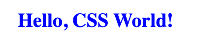
1. Styling Text with CSS One of the fundamental skills in web design is the ability to style text. Here’s a simple example that highlights how to manipulate font properties, color, and text alignment using CSS:
<!DOCTYPE html>
<html>
<head>
 <style>
 .highlighted-text {
 color: blue;
 font-size: 20px;
 text-align: center;
 }
 </style>
</head>
<body>
<h1 class="highlighted-text">Hello, CSS World!</h1>
</body>
</html>
Explanation: This code snippet introduces basic text styling properties in CSS. The .highlighted-text class applies blue color, sets the font size to 20 pixels, and aligns the text to the center. This example serves as an excellent starting point for beginners to see how CSS can change the look and feel of text on a webpage.
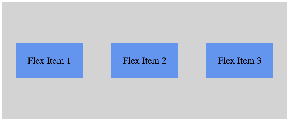
2. Layout with Flexbox Flexbox is a powerful layout tool in CSS, offering a more efficient way to lay out, align, and distribute space among items in a container, even when their size is unknown.
<!DOCTYPE html>
<html>
<head>
 <style>
 .flex-container {
 display: flex;
 justify-content: space-around;
 align-items: center;
 height: 200px;
 background-color: lightgray;
 }
 .flex-item {
 background-color: cornflowerblue;
 padding: 20px;
 margin: 5px;
 }
 </style>
</head>
<body>
<div class="flex-container">
 <div class="flex-item">Flex Item 1</div>
 <div class="flex-item">Flex Item 2</div>
 <div class="flex-item">Flex Item 3</div>
</div>
</body>
</html>
Explanation: This segment showcases how to create a responsive layout using Flexbox. The .flex-container sets up a flexible container that adjusts the space around its items, aligns them centrally, and maintains the layout even when screen sizes change. Each .flex-item is styled distinctly, demonstrating the flexibility of CSS in building responsive and adaptive web designs.
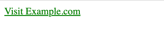
3. Styling Links with Pseudo-Classes Understanding how to style links based on their state enhances user interactions and improves the aesthetic of a website.
<!DOCTYPE html>
<html>
<head>
 <style>
 a:link {
 color: green;
 }
 a:visited {
 color: purple;
 }
 a:hover {
 color: red;
 }
 a:active {
 color: yellow;
 }
 </style>
</head>
<body>
<a href="https://www.example.com">Visit Example.com</a>
</body>
</html>
Explanation: This code targets link pseudo-classes to style links differently depending on their state—unvisited, visited, hovered, or active. This technique is crucial for providing visual cues to users, enhancing the overall usability and interaction of web pages.
Conclusion Mastering these CSS techniques will significantly elevate your ability to design and implement creative, responsive, and user-friendly web pages. Whether you’re styling text, setting up layouts with Flexbox, or enhancing link interactivity, CSS remains an indispensable tool in your web development toolkit.
Styling Text
Learning Objective:
Understand how to style text using CSS, including font properties, color, and text alignment.
Category:
Basics and Text Styling
Code:
<!DOCTYPE html>
<html>
<head>
<style>
.highlighted-text {
color: blue;
font-size: 20px;
text-align: center;
}
</style>
</head>
<body>
<h1 class=”highlighted-text”>Hello, CSS World!</h1>
</body>
</html>
Explanation:
This exercise introduces basic text styling properties in CSS. The .highlighted-text class is defined within the <style> tag in the <head> section of the HTML document. It applies three properties to any HTML element with this class:
- color: blue; changes the text color to blue.
- font-size: 20px; sets the size of the font to 20 pixels.
- text-align: center; aligns the text to the center of its container (in this case, the <body> element).
Layout with Flexbox
Learning Objective:
Learn to use Flexbox for creating flexible and responsive layouts.
Category:
Layouts and Flexbox
Code:
<!DOCTYPE html>
<html>
<head>
<style>
.flex-container {
display: flex;
justify-content: space-around;
align-items: center;
height: 200px;
background-color: lightgray;
}
.flex-item {
background-color: cornflowerblue;
padding: 20px;
margin: 5px;
}
</style>
</head>
<body>
<div class=”flex-container”>
<div class=”flex-item”>Flex Item 1</div>
<div class=”flex-item”>Flex Item 2</div>
<div class=”flex-item”>Flex Item 3</div>
</div>
</body>
</html>
Explanation:
This code demonstrates how to use CSS Flexbox to create a flexible layout. The .flex-container class sets up a flex container by using display: flex;. It also uses justify-content: space-around; to distribute space around the flex items and align-items: center; to align items vertically in the center. The .flex-item class applies styling to each flex item. This exercise teaches the basics of creating responsive layouts with Flexbox.
Styling Links
Learning Objective:
Learn to style links differently based on their state (e.g., hover, visited).
Category:
Pseudo-classes and Links
Code:
<!DOCTYPE html>
<html>
<head>
<style>
a:link {
color: green;
}
a:visited {
color: purple;
}
a:hover {
color: red;
}
a:active {
color: yellow;
}
</style>
</head>
<body>
<a href=”https://www.example.com”>Visit Example.com</a>
</body>
</html>
Explanation:
This exercise focuses on styling links using pseudo-classes. Each pseudo-class targets a different state of the link:
- a:link styles unvisited links.
- a:visited applies styles to links that have been visited by the user.
- a:hover changes the link’s style when the mouse hovers over it.
a:active applies styles when the link is being clicked.
- Learning to style links is essential for improving user experience on websites.