
Responsive Navigation Menu:
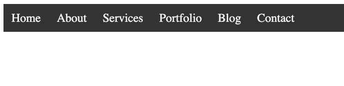
Responsive navigation menu is one of the most important parts of a website. A responsive menu is a menu that changes its layout as the screen size changes. Here is an example of how to create a responsive navigation menu using HTML, CSS, and JavaScript.
This code is an example of a responsive navigation menu that uses HTML, CSS, and JavaScript to create a navigation bar that is optimized for different screen sizes.
The <!DOCTYPE html> declaration at the beginning of the code specifies the document type and version of HTML being used.
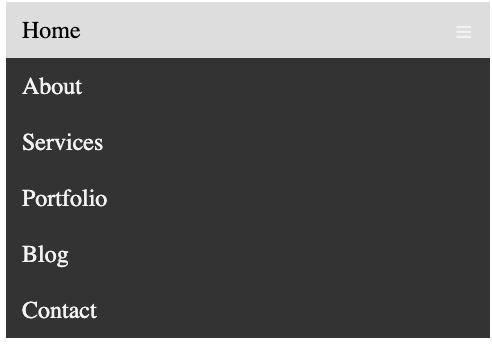
The code defines a navigation bar with class navbar, which contains several links. When the screen size is below 600px, the links are hidden and a menu icon appears. Clicking on the icon toggles the responsive class on the navigation bar, which changes the display style of the links to block and displays them vertically.
The CSS styling defines the appearance of the navigation bar and its links, including font family, background color, text color, and padding. It also defines the styles for the navigation bar when the screen size is below 600px and the responsive class is applied. The @media rule is used to apply these styles only when the screen size matches the specified condition.
The JavaScript code adds functionality to the menu icon by selecting the element with class icon and adding a click event listener. When clicked, the function checks if the navigation bar has the class navbar or navbar responsive and toggles between them. This changes the display style of the navigation links, creating a dropdown menu on small screens.
HTML:
<nav class=”navbar”>
<a href=”#”>Home</a>
<a href=”#”>About</a>
<a href=”#”>Services</a>
<a href=”#”>Portfolio</a>
<a href=”#”>Blog</a>
<a href=”#”>Contact</a>
</nav>
CSS:
.navbar {
overflow: hidden;
background-color: #333;
font-family: Arial, sans-serif;
}
.navbar a {
float: left;
display: block;
color: #f2f2f2;
text-align: center;
padding: 14px 16px;
text-decoration: none;
font-size: 17px;
}
.navbar a:hover {
background-color: #ddd;
color: black;
}
.navbar .icon {
display: none;
}
@media screen and (max-width: 600px) {
.navbar a:not(:first-child) {
display: none;
}
.navbar a.icon {
float: right;
display: block;
}
.navbar.responsive {
position: relative;
}
.navbar.responsive .icon {
position: absolute;
right: 0;
top: 0;
}
.navbar.responsive a {
float: none;
display: block;
text-align: left;
}
}
JavaScript:
document.querySelector(‘.icon’).onclick = function(){
const ele = document.querySelector(‘.navbar’);
if(ele.className === ‘navbar’){
ele.className += ‘ responsive’;
}
}
<!DOCTYPE html>
<html>
<head>
<title>Nav Menu</title>
<style>
.navbar{
background-color: #333;
overflow: hidden;
}
.navbar a{
color:#f2f2f2;
text-decoration: none;
font-size: 1.5em;
padding:14px 16px;
float: left;
display: block;
text-align: center;
}
.navbar a:hover{
background-color: #ddd;
color:black;
}
.navbar .icon{
display: none;
}
@media screen and (max-width: 600px) {
.navbar a:not(:first-child){
display: none;
}
.navbar .icon{
display: block;
float: right;
}
.navbar.responsive{
position: relative;
}
.navbar.responsive .icon{
position: absolute;
right:0;
top:0;
}
.navbar.responsive a{
float: none;
display: block;
text-align: left;
}
}
</style>
</head>
<body>
<nav class=”navbar”>
<a href=”#” class=”icon”>☰</a>
<a href=”#”>Home</a>
<a href=”#”>About</a>
<a href=”#”>Services</a>
<a href=”#”>Portfolio</a>
<a href=”#”>Blog</a>
<a href=”#”>Contact</a>
</nav>
<script>
document.querySelector(‘.icon’).onclick = function(){
const ele = document.querySelector(‘.navbar’);
if(ele.className === ‘navbar’){
ele.className += ‘ responsive’;
}
}
</script>
</body>
</html>